Top 5 Designs Trends
- leonboulter3

- Dec 13, 2018
- 2 min read
When it comes to design, design trends are one of the most important aspects of marketing for businesses. Using the most recent and popular trends is one of the key ways to get a brand to feel new and contemporary to customers. So lets jump into the top 5 design trends on the rise.

3D Design and Typography
With heavy advancements in computer rendering 3D modelling for general design work is on the rise. Three dimensional typography adds alot of depth into a design and can make a piece of work stand out from the rest. It is also very diverse in what you can do, lettering for example can be pretty much any font or style. This has been around for quite a while however it is seeing a comeback probably due to Virtual/Augmented reality.
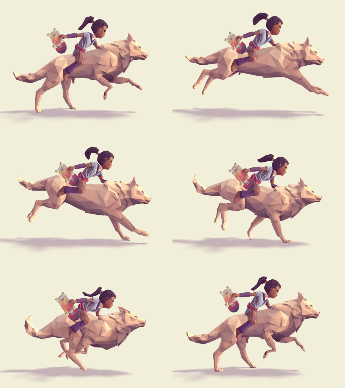
Low Poly Design
Low Poly design originated as a way to decrease rendering times in 3D animation software. In fact it is still used today in alot of video games and animated movies to greatly speed up the development process.
Lately however it has turned into a trend with illustrators, video game developers and animators using the simple polygon shapes in their work to bring across texture and depth without sacrificing a minimalist aesthetic.
Complex Gradients
Gradients are nothing new, however they have been slowly developed and today you can see the advancements they have made. Gradients involve two or more hues progressing from one to another, having a blend blend of colours that can be placed over typography, shape, brands and more.
The idea behind gradients if the fact that they can give of a wide range of styles. From sublte pastle colours, monochromatic hues or even a vibrant shift of colours to grab attention. Gradients can be used alot to make things visually appealing, but they also have a use to add more depth to a image by adding shadows. Which gives more of a three-dimensional appearance.
Broken Grid Layout
Designing with a grid underlay is something pretty much every designer is familiar with, however more recently people have begun to experiment with grid layouts. Designers have begun to break out of the vanilla grid style that we all love and try a broken grid layout. This is not considered a new idea but it definitely has not been fully explored. This is just one possible reason why it is suddenly on the rise especially in UI and UX design.
Isometric Illustrations
In terms of Web design, icons and websites have consistently used flat aesthetics for a while. Yet more projects are beginning to shift to using isomeric icons. This trend is starting to appear not only on websites but varied print projects and other industries.
It is gaining more momentum not just because it has more of a realistic appearance, but because it is a good balance between flat and depth. Using isometric illustrations for navigation and informational elements of a larger design makes it very loud and eye catching while maintaining it's attractiveness.


Comments